Good design does not just make a business look better. It changes what people think is true about the business before anyone has said a word. That is the part many teams miss. They treat design as decoration when customers treat it as evidence.
By Grant Vale · Updated July 13, 2026
When someone lands on a website, picks up a brochure, or sees a brand on a social feed, they are usually asking a few quiet questions: Does this look trustworthy? Does it feel current? Is it easy to understand? And, most important, does it seem like the kind of business I want to deal with?
That first judgment happens quickly. Research from Nielsen Norman Group on first impressions and its work on the aesthetic-usability effect both point in the same direction: people often read visual quality as a signal of overall quality. In practice, that means design is doing more than arranging pixels. It is shaping the customer’s baseline belief about your competence.
Accessibility also matters here. The W3C accessibility introduction and the WCAG contrast guidance are useful reminders that clarity is not optional. When text is hard to read or the layout is hard to parse, the customer does not separate the problem into neat categories. They just feel friction.
By the end of this article, you will be able to spot the design choices that raise trust, the mistakes that quietly lower it, and the practical changes that make a brand feel easier to believe. That is the whole game. Not applause. Confidence.
Design is not just what it looks like and feels like. Design is how it works.
That line, often attributed to Steve Jobs, survives because it still describes the job accurately. If a design looks polished but behaves poorly, the customer notices the mismatch. If it looks modest but works cleanly, the customer usually gives it more credit than the layout itself may deserve. Perception is not a side effect. It is the product.
For readers who want the broader service context around that kind of work, our branding and design services page explains how visual identity, web design, and marketing strategy fit together. If you want more articles like this one, the blog index keeps the related topics in one place.
Understanding Customer Perception
Customer perception is the story people build in their heads about a business based on the signals they can see, hear, and touch. Some of those signals are obvious: logo, color palette, font choices, photography, layout, and copy. Others are quieter: spacing, alignment, speed, consistency, and whether the interface seems to anticipate the user’s next move.
I tend to think of perception as an operating system running in the background. Customers rarely announce, “I have completed a formal visual audit.” They simply make judgments. Good design gives them fewer reasons to hesitate. Bad design gives them reasons they may not even know how to name.
That is why design influences behavior. If a page feels organized, people are more willing to explore it. If a form feels clean and intentional, they are more willing to submit it. If a brand feels dated or improvised, they become cautious. In many cases, the customer is not reacting to the product yet. They are reacting to the conditions around the product.
There are a few common perception signals worth watching:
- Clarity – can the visitor tell what the business does within a few seconds?
- Care – do the details look intentional, or do they look rushed?
- Consistency – do the pages, messages, and visuals feel like they belong to the same company?
- Ease – is the next step obvious, or does the customer have to hunt for it?
- Confidence – does the design make the business feel stable and prepared?
Those signals do not work in isolation. A strong color palette can be undermined by weak typography. A great logo can be weakened by a cluttered layout. Good photography can still fail if the page hierarchy is confused. Customers do not grade each element separately. They take in the whole system, then decide how much trust to extend.
That is why people often talk about design in emotional terms even when the topic is practical. “Clean.” “Busy.” “Professional.” “Cheap.” “Modern.” “Old.” Those are not purely visual descriptions. They are judgments about reliability.
What Customers Read First
Before they read your headline in detail, most customers read the structure around it. The margins. The line length. The hierarchy. The spacing between sections. The way the call to action sits relative to the rest of the page. The human eye is fast, and it does not wait for a briefing.
This is why one weak design decision can distort a whole impression. If the navigation is crowded, the visitor may assume the company is hard to work with. If the typography is too small, they may assume the business does not think about accessibility. If the imagery is generic, they may assume the offer is generic too. The logic is unfair in the courtroom sense. It is not unfair in the market sense. Customers are trying to reduce risk, not win a design critique.
In plain language: good design lowers uncertainty. Uncertainty is expensive. Businesses pay for it in abandoned forms, fewer inquiries, weaker referrals, and more support questions than they should have needed in the first place.
That is also why design and content cannot be separated cleanly. A strong headline can help, but if the page structure is confusing, the message loses force. A clean interface can help, but if the copy sounds vague or self-important, the customer still pulls back. Perception is a joint decision made by words and form together.
Examples of Good vs. Bad Design
The best way to understand perception is to compare what customers see when design is helping and what they see when it is getting in the way. I keep this comparison simple: does the design make the customer feel guided, or does it make the customer feel like they need to decode it?
| Design signal | Good design usually feels like | Bad design usually feels like | Customer reaction |
|---|---|---|---|
| Hierarchy | One clear headline, then supporting detail in a logical order | Everything competes for attention at the same volume | Confidence vs. confusion |
| Typography | Readable sizes, balanced spacing, deliberate contrast | Tiny text, cramped lines, too many font styles | Comfort vs. strain |
| Imagery | Relevant, consistent, and useful to the message | Stock images that feel detached from the offer | Trust vs. skepticism |
| Navigation | Obvious paths and predictable labels | Hidden menus, vague names, too many clicks | Momentum vs. drop-off |
| Calls to action | Clear next step with low friction | Multiple buttons with no priority | Action vs. hesitation |
The interesting part is that the customer usually does not need to be a designer to notice the difference. They can feel it. A good layout makes decisions easier. A weak layout makes decisions feel riskier. That is why the impact of design often shows up in behavior before it shows up in vocabulary.
Before: A Design That Has the Pieces But Not the Order
In a rougher baseline, the business may still have good capabilities, but the design gives those capabilities too little structure. The page looks assembled instead of composed. That can happen when the typography is inconsistent, the spacing is crowded, or the visual rhythm changes from section to section without a clear reason.
In those cases, the customer may not say, “This brand lacks discipline.” They may simply move on. The exit is the same either way.
After: A Design That Gives the Eye a Clear Path
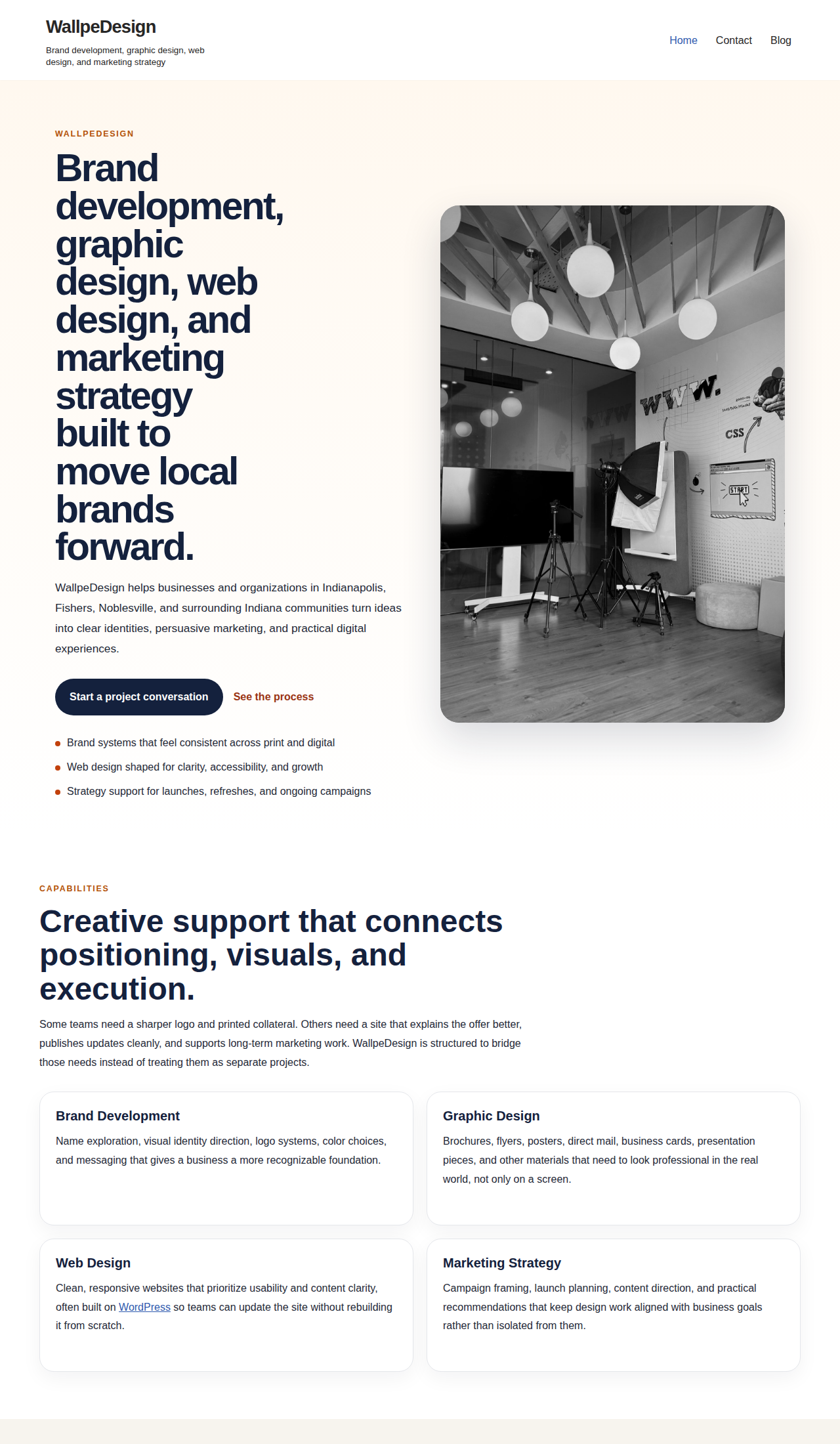
Once the layout is organized, the customer can spend their attention on the offer instead of on the interface. That shift matters. It changes the emotional cost of reading the page. It also changes the business outcome because fewer visitors abandon the page before they understand the value.
This is the part many owners underestimate. Good design is not only a style choice. It is a reduction in cognitive load. A clearer page asks less from the customer, which usually makes the business feel more capable.
Common Design Failures That Damage Perception
- Inconsistent spacing. When margins and gaps keep changing, the business feels less controlled.
- Unclear headers. If the customer cannot name the page purpose quickly, the design has already spent goodwill.
- Weak contrast. Hard-to-read text makes a page feel less considerate and less accessible.
- Generic imagery. If the visuals could belong to anyone, they help no one.
- Overloaded pages. Too much content in one view makes the business seem noisy rather than helpful.
These failures are not dramatic. That is why they survive. Nobody enters the room and announces, “I have made the interface slightly more tiring.” They just leave a little sooner than they would have otherwise.
In my experience, the most dangerous bad design is not ugly design. It is ambiguous design. Ugly can still be memorable if it is clear. Ambiguity is harder because it forces the customer to interpret the business instead of trusting it.
Benefits of Investing in Quality Design
Investing in quality design is not about chasing aesthetics for their own sake. It is about building conditions where customers can believe what you say more easily. That has practical effects across marketing, sales, and support.
1. Stronger Trust
Trust is the first dividend. When a business looks thoughtful, customers are more willing to believe the business is thoughtful. That may sound circular, and in a way it is. Perception often works by signals, not proofs. Clean design is one of the fastest signals available.
For a service business, that matters everywhere: homepage, service pages, proposal decks, brochures, email signatures, and follow-up materials. If the design system is stable, each touchpoint reinforces the last one. If it is not, every touchpoint has to rebuild the case from scratch.
2. Better Readability and Less Friction
Good design lowers the effort required to understand the message. That is not cosmetic. That is conversion work. Visitors are more likely to stay, scroll, and act when they do not have to fight the page to get the information.
Accessibility standards are useful here because they force the issue back to basics. High contrast, readable text, and obvious structure are not luxuries. They are respect. The W3C guidance on accessibility and contrast is a practical reminder that the least glamorous parts of design often do the most heavy lifting.
When a business needs to communicate with a broad audience, that clarity is worth protecting. The customer should not need perfect eyesight, perfect attention, or perfect patience to understand the offer.
3. A More Memorable Brand
People remember brands that feel coherent. That coherence can come from type, color, spacing, photography style, iconography, or the way information is repeated across channels. A customer may not recall every element, but they will remember the overall feel.
This is where design supports word of mouth. If someone can describe your business with a sentence like “They look organized and easy to work with,” that is already useful marketing. If they can only say “I think I saw them somewhere,” the design system did not leave enough of a mark.
A memorable brand is not necessarily the loudest one. It is often the one that is easiest to recognize twice.
4. Lower Support Burden
Good design can reduce the number of questions people need to ask. Clear navigation reduces “where do I click?” questions. Better labels reduce “what does this do?” questions. Cleaner forms reduce “why won’t this submit?” questions. It all adds up.
That is why design quality belongs in operational conversations, not just creative ones. Every unnecessary question costs time. Every missing cue creates avoidable friction. A well-designed customer journey saves both sides from repeat explanations.
5. Stronger Confidence at Scale
At small scale, a few design inconsistencies can be forgiven. At larger scale, they become expensive. As the site grows, the email campaigns multiply, the service pages expand, and the social templates start doing real work. If there is no design system underneath, the whole brand starts to wobble.
This is also where workflow discipline matters. When a team wants to keep content updates, publishing, and routine site changes consistent, a neutral resource like AI consulting services can help frame where automation supports the process and where human review needs to stay in the loop. The point is not to automate taste. The point is to avoid drift.
If you are building the business side of that system at the same time, it helps to keep one eye on the service page and one eye on the content path. Our services overview is the place to start if you want to see how the design work connects with the wider marketing structure.
Benefits at a Glance
| Business goal | How good design helps | What customers feel |
|---|---|---|
| Win trust | Signals care, clarity, and consistency | “This looks legitimate.” |
| Increase engagement | Makes reading and navigation easier | “I can find what I need.” |
| Improve conversion | Reduces uncertainty and hesitation | “I know what to do next.” |
| Support growth | Keeps the brand coherent across new pages and campaigns | “This business feels put together.” |
A Simple Framework for Evaluating Your Own Design
When I review a design system, I keep the evaluation practical. You do not need a hundred questions. You need the right five or six. If the design survives those, it is probably working. If it fails them, the customer probably noticed already.
- Can a new visitor understand the offer in one screen? If not, the message may be buried under the layout.
- Does the page feel consistent from top to bottom? Consistency is one of the fastest ways to appear reliable.
- Is the next action obvious? A customer should not need a map for the call to action.
- Does the typography support easy reading on mobile? If it does not, the design is fighting the medium.
- Are the visuals relevant rather than generic? A brand looks more credible when the imagery fits the message.
- Does the design make the business feel easier to work with? That is the question that usually decides the outcome.
You can apply the same logic to nearly any customer-facing asset. A landing page, a brochure, a proposal, a one-sheet, or a social post all need the same basic discipline: clear purpose, orderly structure, and a calm path forward.
For teams that want to build that discipline over time, the best next step is not a complete redesign on day one. It is a baseline. Decide what has to be consistent. Decide what can vary. Then document the minimum safe setup so the brand does not wander every time a new asset gets published.
If you want a broader publishing perspective alongside this one, the blog index collects related topics on branding, web design, marketing strategy, and content. That makes it easier to compare one design decision against the larger system instead of treating every page as a one-off exception.
Design Review Questions
| Question | What a strong answer sounds like | Why it matters |
|---|---|---|
| What should the visitor think first? | One clear promise, not three competing ideas | First impressions set the frame |
| What should the visitor do next? | One obvious action with a sensible label | Clear next steps reduce hesitation |
| What would make the brand seem less credible? | Inconsistency, clutter, tiny text, generic images | It is easier to remove risk than to argue it away later |
| What would make the brand feel more dependable? | Consistency, readable design, relevant visuals, simple hierarchy | Dependability is the emotional outcome customers want |
Conclusion
Good design changes customer perception because it changes the burden of interpretation. It makes the business easier to understand, easier to trust, and easier to remember. Bad design does the opposite. It adds friction, and friction becomes doubt.
The practical lesson is simple: if you want customers to feel confident, design the experience so it deserves that confidence. Put the message in order. Use readable type. Keep the visuals relevant. Make the next step obvious. Then check whether the whole thing feels like one disciplined system instead of a stack of hopeful pieces.
If your current website or brand materials feel close but not quite settled, that is the place to intervene. A careful revision usually does more than a loud reinvention. The market notices when a business has decided what it is doing.
If you are ready to tighten the signal, start with the pages people see first. Review the homepage. Review the service pages. Review the contact path. Then work outward from there. When the front door is strong, the rest of the house does not have to pretend.
Key points:
- Design shapes trust before customers read every detail.
- Good design lowers friction and makes the next step easier.
- Bad design often feels less credible even when the offer is strong.
- Consistency across type, layout, and imagery helps the brand feel dependable.
- Careful design review is a business discipline, not just a creative preference.
If you want help turning that discipline into a practical brand or web system, start with our services page or take a slower look through the blog for related guidance.